Assessment Pro UX Case Study.

AI-driven remote assessment tool design

Assessment Pro UX Case Study.

AI-driven remote assessment tool design

Assessment Pro UX Case Study.

AI-driven remote assessment tool design

Project Overview

Project Overview

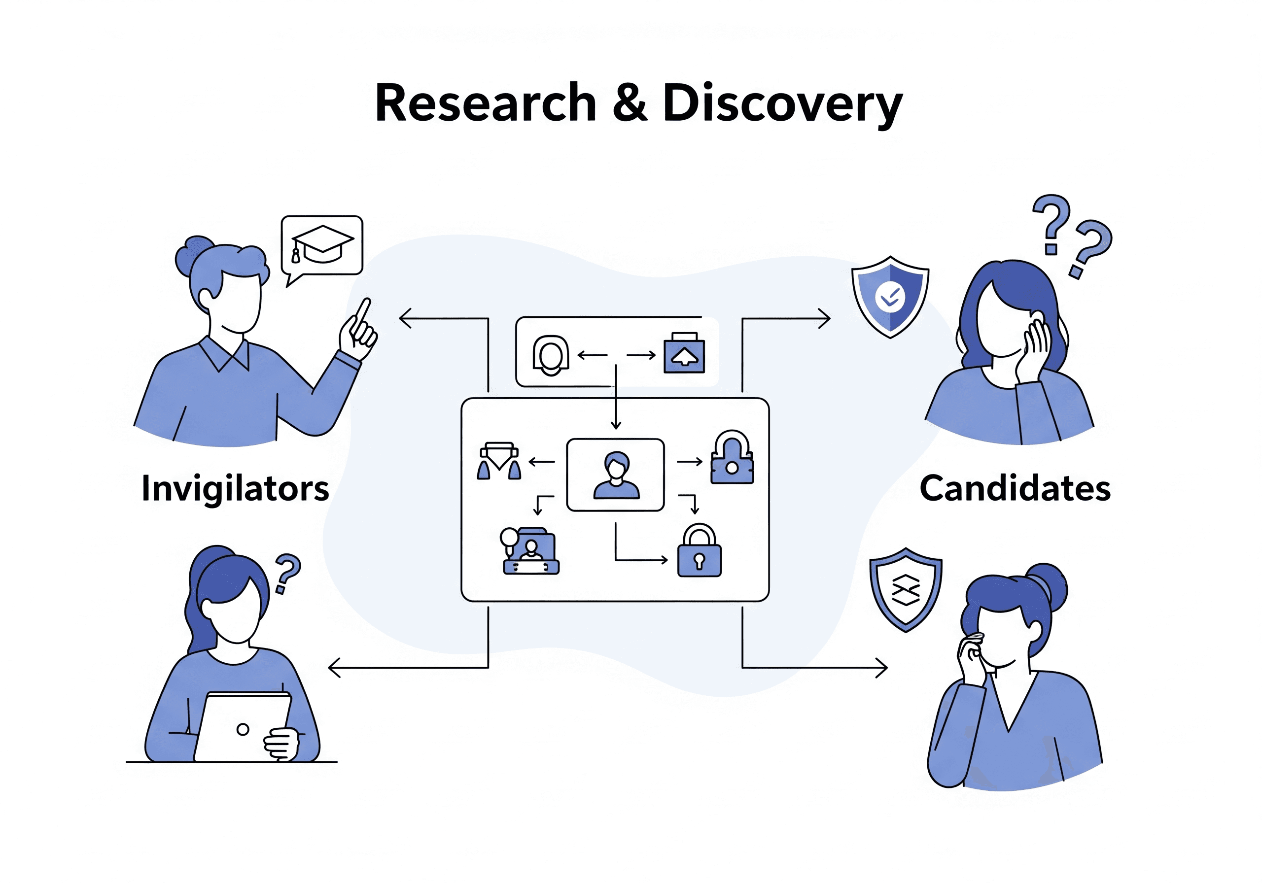
Oto-Code is an AI-driven coding and cognitive testing platform built for invigilated remote assessments. As UX Designer, I focused on designing seamless and secure user journeys for invigilators and candidates—prioritizing usability, clarity, and test integrity.

Assessment Pro is an AI-driven coding and cognitive testing platform built for invigilated remote assessments. As UX Designer, I focused on designing seamless and secure user journeys for invigilators and candidates—prioritizing usability, clarity, and test integrity.

Client: Oto-Code
Role: UX Designer
Duration: 10 Months
Platform: Web Application
Target Users: AI Invigialtor, Human Invigilators and Candidates

Client: Otomeyt
Role: UX Designer
Duration: 10 Months
Platform: Web Application
Target Users: AI Invigialtor, Human Invigilators and Candidates

Goals

Goals

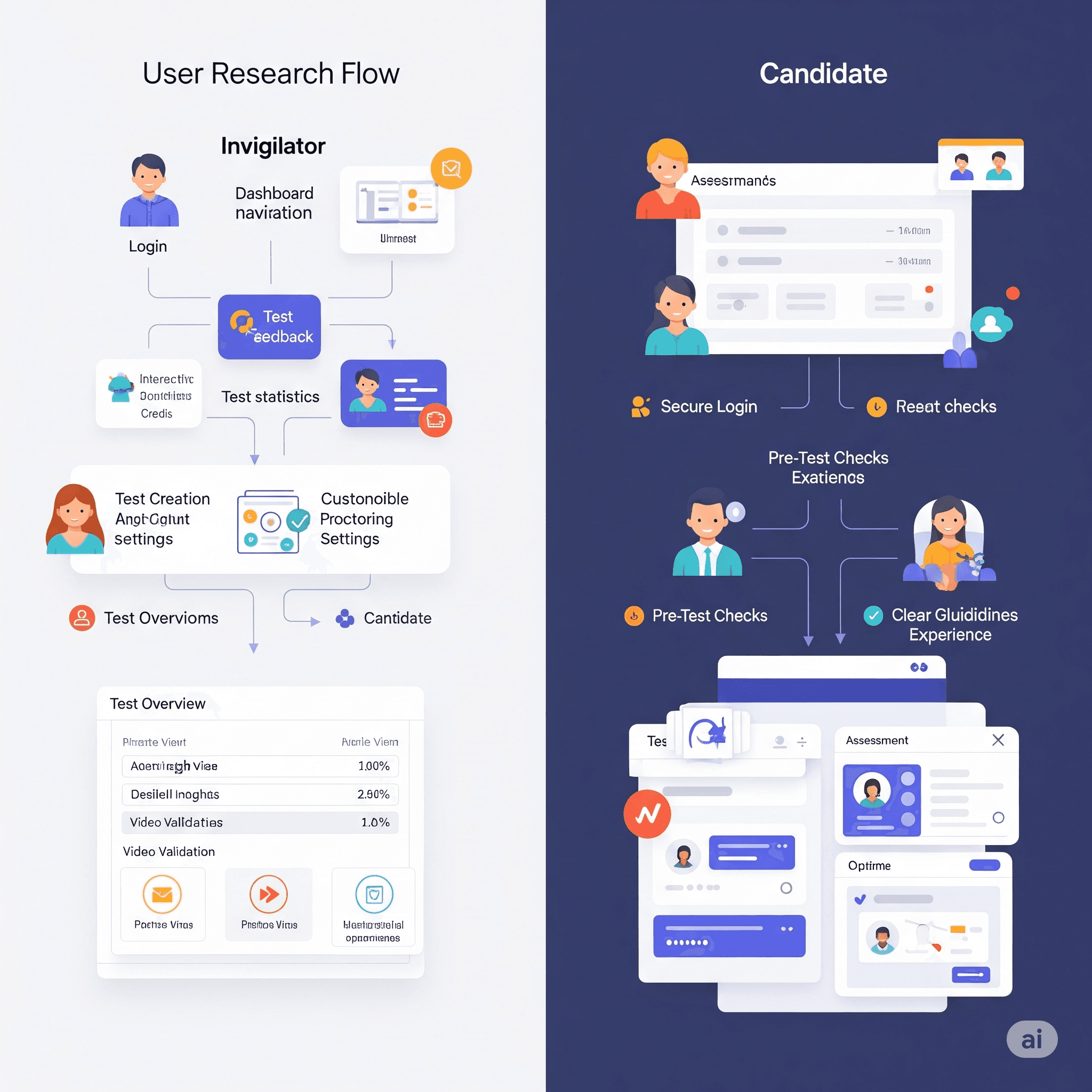
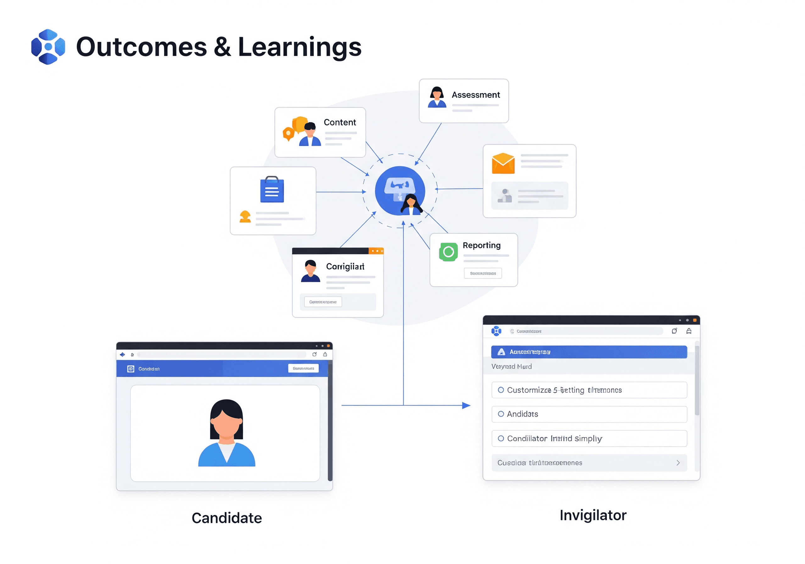
  • Build an intuitive dashboard for Invigilators to manage tests and candidates.

  • Create a flexible test creation interface supporting cognitive and coding assessments.

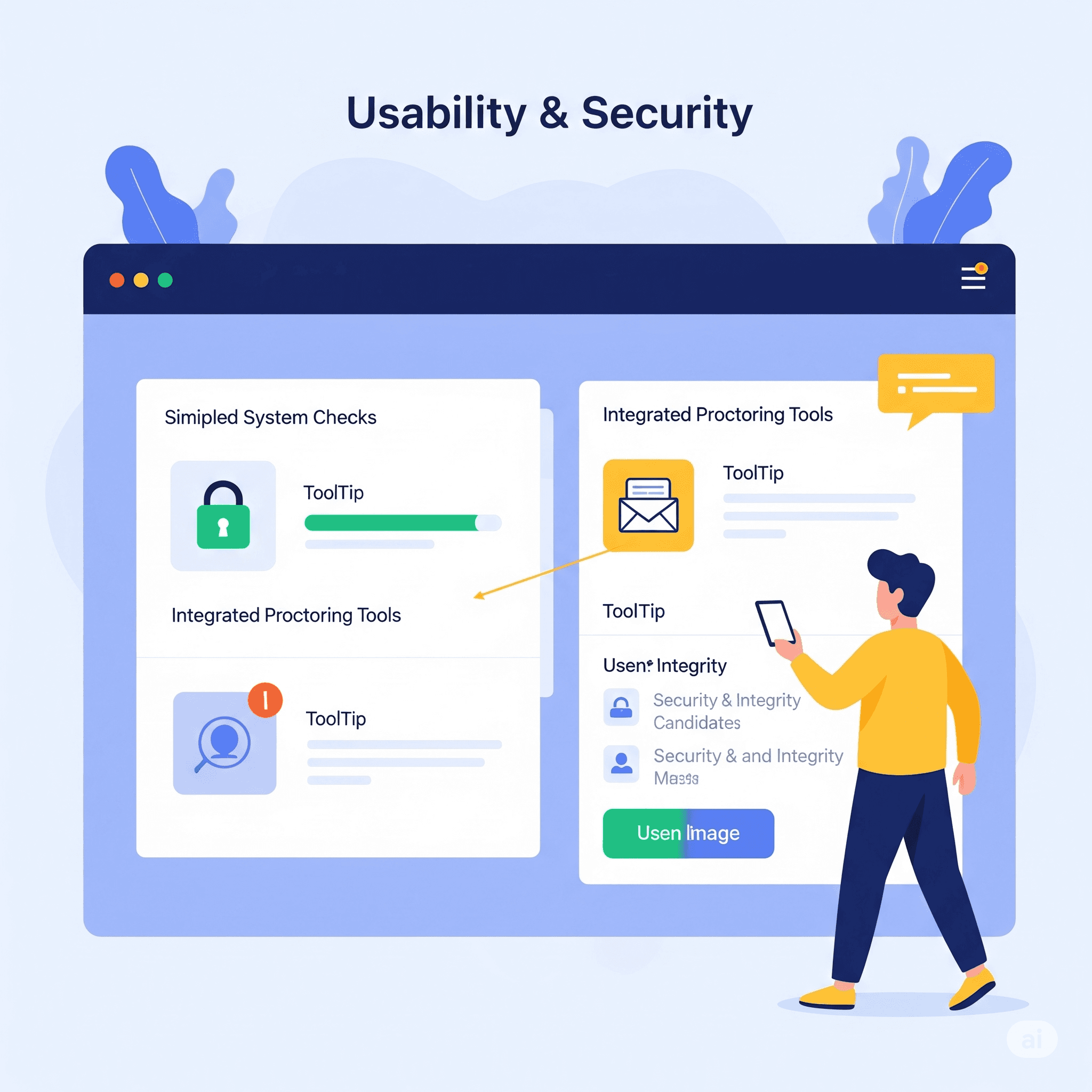
  • Ensure a secure and frictionless experience for candidates taking remote proctored tests.

  • Enable detailed performance tracking and candidate management post-assessment.

Discovery & Research

Discovery & Research

User personas were identified: Invigilators want control, visualization and clear workflows; Candidates prioritize clarity and privacy. Research revealed key pain points such as technology anxiety and the importance of secure, clear interactions.

User Flow & Structure

User Flow & Structure

Invigilator login, dashboard navigation, interactive cards (credits, test stats, feedback), test creation via tabs and proctoring settings, table view for test overviews, and actions like video validation. Candidate flow includes secure login, pre-test checks, and clear assessment UI.

Design Approach & Wireframes

Design Approach & Wireframes

Low-fidelity wireframes mapped out journeys for both roles. High-fidelity UI prioritized visual clarity, responsive layouts, and accessible CTAs. Strong visual hierarchy and minimalist styles promote usability across devices.

Usability & Security

Usability & Security

Design reduced cognitive load, with clear indicators for system checks and integrated proctoring tooltips for transparency. Security and integrity measures were balanced with a user-friendly approach for stressed candidates.

Outcomes & Learnings

Outcomes & Learnings

Delivered secure, scalable UX supporting different needs. Achieved a modular, role-based interface. Key learning: balancing invigilator control with candidate simplicity is vital in high-stakes environments.